I’m going to bet that outside of work, most of the time you spend online is spent on your phone (or maybe a tablet). Whether you’re browsing websites, shopping or doom scrolling, chances are you’re doing it sitting in front of the TV on a phone or tablet. Google knows that users are more likely
I’m going to bet that outside of work, most of the time you spend online is spent on your phone (or maybe a tablet).
Whether you’re browsing websites, shopping or doom scrolling, chances are you’re doing it sitting in front of the TV on a phone or tablet.
Google knows that users are more likely to be online using mobile than desktop, which is why it prioritises mobile versions of websites for search rankings.
If you’re site isn’t mobile-friendly, this can stop your site ranking as high as it could in search engine results pages, or stop it ranking at all.
That means less visibility, less traffic and fewer sales.
And that, I think you’ll agree, isn’t good for your business.
So let’s help by going into what mobile-first indexing is, how you can optimise your website for mobile and what the impact (good and bad) can be on your SEO campaigns.
Table of Contents
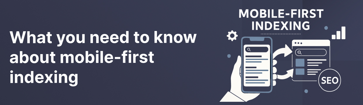
What is mobile-first indexing?
Mobile-first indexing means search engines use the mobile version of your website to decide where to rank your pages in results pages.
It wasn’t always like this.
Back in the day (before smartphones and tablets), search engines would look at the desktop version of your site and use that to rank your site. Mobile was more of an afterthought.
But with mobile making up more than 60% of web traffic (according to Statista), Google and other search engines are now more interested in the mobile version of your website.
You can’t treat the mobile version of your website as a second thought. If anything, you should treat your website as mobile first.
There are lots of benefits to doing this.
First, it means the user experience will be better because your site will be built to match the devices customers prefer to use. This can also mean better conversions.
From an SEO perspective, thinking mobile-first for your website also improves the performance of your SEO campaigns.
How does mobile-first indexing work?
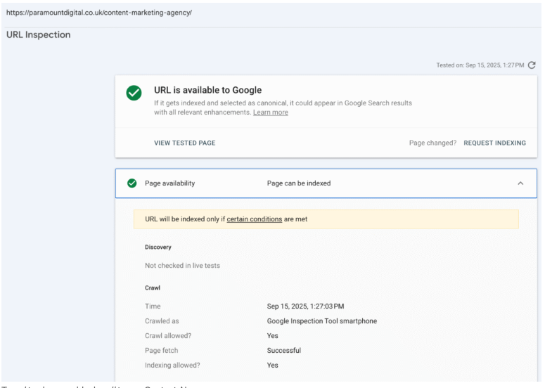
Googlebot-Smartphone takes priority. It crawls, renders, and decides rankings based on what it finds. Use Search Console’s URL Inspection to see what it saw.
Consistency matters on mobile and desktop. Keep copy, internal links, schema, and tags identical across devices. What’s absent on mobile is invisible to Google.
Experience signals count. Core Web Vitals (loading, responsiveness, stability) are now key to search engine rankings.
Why did Google move to mobile-first?
Because it follows the trend of users.
Despite what you might sometimes think, Google isn’t some all-powerful overlord dictating search trends.
It’s actually just following users and changing what it does to match what people do.
People moved to mobile first as more smartphones and tablets supported web browsing and shopping, so Google followed.
How to create a mobile-first website experience
Being mobile-first isn’t just good for rankings.
It’s important for creating smoother shopping experiences that keep users on your website and make it easy for them to complete purchases or get in touch with you.
This is how to create mobile-first experiences:
Use responsive web page layouts
Responsive web pages automatically adapt to the type of screen your page is being viewed on.
It means that text remains readable on every screen size, product pictures are visible and look good and, importantly, CTA buttons are easily clickable.
Doing this means you create a positive user experience for every user on every device, and satisfy search engine requirements for mobile indexing.
Improve your website speed
If you’re webpage doesn’t load within three seconds, you risk losing more than 40% of your traffic (because users just abandon you and try another website).
You risk losing about 25% of users if your page hasn’t loaded at four seconds. And every second it takes for your site to load reduces customer satisfaction by 16%.
Having a slow-loading website doesn’t just reduce the customer experience and damage your reputation (64% of shoppers won’t revisit a slow-loading website), it also hurts your search rankings, so fewer customers will even see you in the first place.
You can improve your website speed in a few ways:
Compress file sizes: Reduce file sizes of images and videos
Use lazy loading: Instead of your entire page loading at once, it loads as the user scrolls
Reduce third-party scripts: Third-party scripts can bloat your website and make it slower to load
Don’t use pop-ups on mobile
Pop-ups can be great for getting user information. But on mobile, a pop-up can take up the entire screen or get in the way of important information. And if it hasn’t been optimised for a mobile screen, it can be pretty much impossible to close, which wrecks the user experience.
Use an easy-to-read font
You might have a quirky brand, but if users can’t read your website copy because it doesn’t display properly on a small screen, you’re not going to sell much.
So use a larger, easy-to-read font.
Check button sizes
Buttons like CTAs need to be treated differently on mobile because they need to be big enough to stand out and encourage clicks, but not so big they take up too much room and obscure the rest of the page.
Keep buttons in positions on a mobile page so that they’re easy to see and click.
Try a minimalist design
This goes for mobile and desktop webpage design (but is particularly important on mobile).
Too much clutter on a web page can pull a user’s attention away from what you want them to focus on (copy, product images, CTAs etc)
It’s even worse on mobile or smaller screens.
When designing a mobile page, think critically about what absolutely needs to be included on a page, and remove anything that doesn’t serve a specific purpose.
Test your mobile pages
Ok, this one sounds obvious.
But you’d be surprised how easy it can be to test web pages on a desktop (because web pages are designed on desktops), and completely forget to think about how your page will display on mobile.
Be sure to check how your webpages adapt and display on mobile.
What if you don’t have a mobile-ready website?
If your website hasn’t been designed and built as mobile-first, you risk having a website that doesn’t work for people and doesn’t rank in search engine results pages.
These are the biggest risks you face:
Low visibility: Search engines won’t rank your pages as high if you’ve not optimised for mobile.
User engagement: If you’re site doesn’t work properly on mobile, or doesn’t load quickly, you’ll lose users because they never take an action.
Lost revenue: If users abandon your site because it’s too slow, or they can’t use it easily, the ultimate risk is a loss in revenue
How to check the mobile readiness of a website
Don’t panic if you’re not sure your website is designed and ready for mobile-first indexing. It’s easy to check how your site performs and what improvements you could make.
Google Search Console: Search Console’s URL inspection tool lets you run a mobile crawl of your web pages to see how they perform.
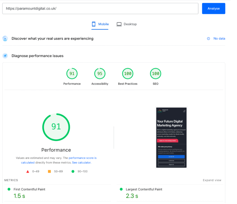
PageSpeed Insights: PageSpeed Insights/ Lighthouse lets you test your website’s core web vitals to see how you perform.
Chrome DevTools: DevTools allows you to check for navigation, pop-ups and layouts.
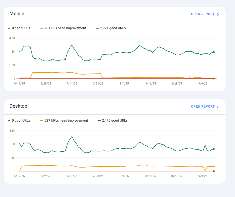
Core Web Vitals report: Google’s Core Web Vitals report in search console lets you see how your website URLs perform against benchmarks to identify any improvements you could make:
Need help optimising your website for mobile?
Making your website mobile-first for user experience and search engine indexing will help improve your online visibility and conversions from search traffic.
If you’re website isn’t set up for mobile searches, you risk losing sales and customers who will go to a competitor’s site that offers them the experience they want.
He’ll take an in-depth look at your current website performance and provide advice you can take away to start seeing improved results, whether you decide to work with us or not.
With six years of experience in SEO and Content Marketing, Kieran firmly has had a hand in both camps when it comes to this aspect of digital marketing.
Kieran started his marketing journey as a Content Executive, producing content for client websites. He then transitioned to the SEO department, as an SEO executive, applying technical SEO practices to better campaigns.
Kieran then moved to SEO manager, before transitioning into his new role of Head of Content Marketing, leading an exciting new era for the Content Marketing department!
Book a 30 minute consultation call with one of our team so we can understand your goals for digital marketing and what services you need within your budget.
2. Let’s get strategic
Once we know where you want to get to, we’ll put a plan in place to get you there. You’ll get a clear outline explaining all the costs and what results you can expect.
3. Let’s start growing your business
Once we’re all pointing in the right direction our expert team will get to work delivering what we’ve promised and getting you the best ROI possible.